
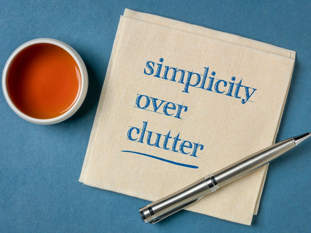
A landing page is essential for converting website visitors into leads and customers. However, many businesses undermine their landing page effectiveness with cluttered designs that overwhelm visitors. Research shows cluttered pages deliver poor conversion rates, high bounce rates, and frustrated audiences.
This article will analyze the pitfalls of cluttered landing page design and provide actionable tips for simplifying pages to boost conversions. First, we’ll examine why decluttering improves user experience through better scanability, intuitive flows, and focused messaging. Next, common examples of ineffective cluttered pages will be critiqued. Finally, tactical simplification guidelines around layout, visual hierarchy and content editing will be presented.
In the modern digital era, the average internet user expects seamless, focused website experiences. Companies that fail to meet these expectations see crashes in traffic quality and return visits. By learning to cut the clutter, brands can align visitor experience with business goals for each landing page. The result is more leads captured, customers acquired, and revenue unlocked from existing traffic. Aligning branding with simplified user experience is the golden ticket!
Let’s dive in and unlock the many benefits of decluttering landing pages!
We’ve all come across landing pages that are just too jam-packed, right? There’s a crazy long headline, images and buttons popping up everywhere, panels sliding in from all angles trying to grab your attention. It’s sensory overload!
Now don’t get me wrong – some level of excitement and activity can be good. But most cluttered pages go overboard and just end up frustrating visitors. So what exactly happens when a page is too cluttered?
Well, first our eyes don’t know where to focus. There are just too many things flashing, bouncing, spinning and blinking at us! It’s like standing in the middle of Times Square at midnight. You want to take it all in but you can’t. Next, clutter makes it way harder to find what you’re actually looking for. Important info gets buried or hidden behind clutter. Sure that spinning coupon code banner seems cool at first, but after the 10th popup I just want to find the contact form!
Finally, clutter simply overwhelms our brains, creates confusion and triggers frustration. As humans we have built in visual systems and limited cognitive bandwidth. Cluttered pages throw all of that out of whack. The more we struggle to parse the page, the less patience we have. Next thing you know, we’re pounding the back button and vowing never to return!
So in summary, excess clutter negatively impacts user experience by:
The result? Bounces, abandoned carts, missed conversions, and angry customers. No bueno. This is why decluttering and simplification are so critical when designing landing pages. A clean, simplified approach makes sure visitors can easily find value on your site. More on that coming up!
Alright, so now that we’ve seen why clutter bugs users so much, let’s talk about why clean and uncluttered design is so vital for landing pages.
First and foremost, spare and spacious landing page layouts just make info easier to scan and digest. They allow visitors to quickly home in on value without unnecessary obstacles. With ample white space between elements and sections, everything has room to breathe. Our eyes can flow effortlessly rather than getting tangled up.
On the flip side, dense and crowded pages trigger fatigue fast. Ever try reading a textbook with no margins, teeny fonts packed together? You probably zone out after a page or two. Now imagine that the textbook was also blinking, popping up alerts and playing video! Exhausting, I know.
Beyond scannability, clean pages also establish better visual hierarchy i.e. how elements are positioned and emphasized on the page. When everything on the page fights for attention, it’s tough to decipher what’s loud vs quiet or big vs small. But with plenty of space and selective use of things like color, size and motion we guide visitors step by step.
For example, that big striking hero image draws you in first, then the clear headline tells you about the offer, then buttons lead you to act. No confusion or decision paralysis! The same logic extends to navigation – clean menus, simple intuitive flows. This sense of focus and direction is super important for conversion optimization.
So in short, uncluttered space, well-defined visual weight and clean layouts all add up to pages that are inviting, scannable and create intuitive user experiences. Visitors feel in control rather than overwhelmed. And that is the key to getting folks to stick around and engage further!
Alright, now that we’ve covered why clean and focused design is so important, let’s flip things around. What are some prime examples of overly cluttered landing page layouts? What kind of clutter causes the most headaches? I’ll walk through some of the worst offenders:
These are the large banner images and headline text at the very top of landing pages. They are prime real estate for first impressions! But often we see hero banners cramming in a dozen different headlines, graphics, carousels, etc. This steals impact from what should be a clean intro.
Call to actions are obviously vital on landing pages. But stuffing a page with endless CTAs of equal size and emphasis is counterproductive. Visitors need to be selectively led through next steps, not overwhelmed by a dozen flashing BUY NOW buttons!
Exit intent popups, chat boxes, modal windows. These can boost engagement when used sparingly. But cluttered pages barrage you with them on page load. Widget overload distracts from the core offerings.
Understandably, businesses want to communicate value across products or services. But there is a line between an appropriate amount of supportive content/visuals and total information dump! Endless columns of text and imagery quickly lose visitors.
On cluttered pages, various sections and content types tend to bleed together. For example walls of text without any image breakup; CTAs and body text formatted exactly the same. This makes it exhausting to parse relevant pieces.
These are just some prime types of landing page clutter I see often! At the core, most clutter issues stem from trying to communicate too many things at once rather than selectively highlighting value. The key is to simplify and direct focus!
Alright, so now that we’ve covered pitfalls to avoid, let’s shift gears and talk specifics on building better landing pages with less clutter! I want to start with best practices for hero banner sections.
As a refresher, the hero banner refers to that visually impactful header area sitting front and center on a landing page. It generally consists of three core elements:
When done right, hero banners make for a clean and attention-grabbing intro to set the page’s value proposition. So what sets the great apart from the mediocre?
For one, the imagery or graphic visual needs to be crisp, bright and imaginative. Stock photos of handshakes and desktop computers make people snooze! Go vivid with colors, layer in textures, and showcase real people. This creative visual density draws the eye.
Secondly, that big bold headline sitting on top needs to clearly communicate a tangible benefit or desire the visitor is seeking. Speak directly to them and their needs. “The Fastest Domestic Shipping” or “Voted #1 CX 5 Years Running”. Avoid vague corporate jargon up here.
Finally, any supportive body copy should be short, scannable paragraphs rather than a dense block of text. Briefly expand on the headline’s promise without diluting it.
Follow these guidelines, and hero sections will capture visitor attention the right way, while laying the visual and informational foundation for the rest of the page! A clean first impression that kicks things off on the right foot for stickiness and conversion.

Alright, so an impactful hero banner hooks visitors in the right way. But where do we guide them next? This brings us to mapping user flow down the page. We want to craft a clear path that moves visitors from attraction to action. This is where clear calls-to-action come in.
Effective CTAs don’t just randomly get sprinkled all over a page. They need to be strategically placed to continue momentum in the right direction. The best pages shape intuitive journeys step-by-step towards conversion goals.
For example, on an ecommerce site’s product page this might involve:
See how each section builds on the previous one, moving visitors closer towards transacting? There is a narrative flow at play here, not just a random assortment of page elements. We are guiding the user further down the path-to-purchase with each piece of content and corresponding CTA.
This allows visitors to smoothly evaluate info, engage with options, and make decisions. There are no confusing jumps or abrupt walls. And the singular CTAs at each step also prevent choice overload. Compare a cluttered page with 14 competing buttons – that’s anxiety inducing!
Instead, a clean path and selective CTAs provide direction and clarity. This visible progress towards goals results in less drop offs, and more conversions for the brand. Strong flows minimize distraction and friction. So take the time to map user flow down the page when laying out content and calls to action. Shape the journey purposefully from start to finish!
As we’ve discussed so far, landing pages require clean layout and visible structure so visitors can easily find value. An underutilized way to further improve clarity? Maximizing whitespace in page composition.
Whitespace refers to the ample empty space between various page elements like sections, columns, buttons, etc that would otherwise be mashed together. Like giving the page room to breathe. It’s sometimes called “negative space”, but that undersells the positives!
Appropriate whitespace brings all sorts of benefits for landing page optimization:
First, ample spacing between sections and linebreaks between paragraphs improve overall scannability and readability. Our eyes navigate and comprehend faster when not trying to parse dense walls of content. Next, whitespace allows key elements like CTAs to stand out since they aren’t tightly surrounded. Increased emphasis guides visitors more quickly to actions.
Whitespace also visually segments the page into clear groups of related info. Related headers, copy, graphics have space between other clusters of content. This partitioning helps communication; users know what goes with what. Finally extra breathing room reduces cognitive load and anxiety tied to super dense pages. Blank space feels open and inviting rather than intimidating to users.
Now there is a balance here – you don’t want acres of dead space on a page. But in general, err towards a little more padding between elements than your gut says. Don’t try to cram every last pixel! Appropriately used whitespace helps highlight hero messages and simplifies visual flow from top to bottom.

Alright, so we’ve talked about using whitespace to prevent landing pages from becoming too dense and crowded. Next let’s discuss the concept of visual hierarchy and how it also fights clutter.
Visual hierarchy refers to the ordering of visual elements on the page to show their level of importance. It guides visitors on where to focus attention and in what sequence. Hierarchy brings structure and focus to layouts.
We establish hierarchy through creative use of things like:
Used intentionally, these elements flag different pieces of content based on their priority for communicating to visitors. For example, typically hero sections leverage size, color and whitespace to stand out first and set page context. Then supporting sections might use medium sized headers and paragraph text to provide details behind the main message. Finally, lighter font CTAs guide visitors to take action.
See the spectrum from loud to soft? This makes absorbing the page smooth and intuitive, rather than visitors struggling to know what deserves focus. When everything fights evenly for attention, confusion sets in. But a clean hierarchy acts like a map guiding visitors step by step in order of importance.
So when designing and formatting landing pages, take time to intentionally shape hierarchy between sections, integrating whitespace and the other methods above. Craft distinction in emphasis so visitors are never wondering what to engage with first, second, third, etc. Visible order powered by hierarchy will keep their journey on course!
Alright, let’s shift gears and chat fonts for a minute! Yes, even something as small as the fonts and typography used on your landing page can make a big difference in reducing visual clutter.
Here are some key guidelines all focused on enhancing readability:
Resist the urge to use a whole slew of different fancy display fonts across sections. One or two complementary pairings max is best for consistency/flow. Consider a clean readable face like Open Sans for body text and maybe a contrasting accent option like Merriweather for standout headers.
Heading fonts can be bumped up reasonably larger to create hierarchy, but avoid styles that are overtly giant/distracting. Body copy should remain readable but not tiny. Default browser sizes are usually reasonable starting points to then tweak.
The space between lines of text impacts scannability just like general whitespace does. If lines are smashed too tightly, stacking text becomes more dense and tougher to digest. Loosen up line spacing for improved flow.
Beyond line height inside paragraphs, the spacing between body copy matters hugely. Compound the scannability and less cluttered appearance by adding extra padding between chunks of text content.
So there you have it – a few key font and typography considerations to help keep pages clean and enhance general text readability. Proper textual formatting ensures the “around” the text looks good just as much as font faces! By showing respect for readability in typography choices, pages feel less heavy/cluttered.
We’ve covered a lot so far! To recap, let’s run through my top 10 tactical tips for decluttering and streamlining any messy, overloaded landing page:
There you have it! 10 tips centered on stripping away excess, spotlighting value, and guiding visitors smoothly. Decluttering takes work but pays off hugely in key metrics. Follow these guidelines and you’ll have way happier visitors who can actually use your site!
Alright, we’ve covered a ton so far on principles for decluttering and optimizing landing pages! Let’s wrap up with some common questions around simplifying pages:
There’s no one size fits all answer, but generally focus on quality over quantity. A good rule of thumb is that visitors should be able to fully scroll a page in under two minutes. Be ruthless in cutting fluffy paragraphs and secondary points. Core value first!
Again no magic number, but as a general best practice limit to 1-2 primary CTAs per section. Too many competing calls detract from user focus. Map the key desired user actions and guide to those selectively.
Not necessarily! Hero images outperform video much of the time. But selective use of videos to showcase products, testimonials etc can be great if kept concise. Avoid autoplay and customize thumbnail images.
Leveraging tabs/accordions to collapse and expand content selectively is one way. Also consider secondary pages focused on single topics versus cramping everything above the fold. Crosslink across pages for smooth journeys.
Not if executed well! Clever visuals and typography limited to the most valuable content creates plenty of vibrant flair. And negative space allows striking focal points to shine even brighter.
Hopefully these FAQs help further your understanding of streamlined, simplified landing page design. Now let’s drive home some key takeaways!
We’ve covered a ton of ground detailing the pitfalls of cluttered landing page design and tactics to simplify for better conversion. Let’s drive home some core takeaways:
Plenty of tactics can drive visitors to your pages, but conversion and ROI suffer if they instantly bounce on confusing layouts. Decluttering is step one towards sticky site experiences.
Trying to cram every product feature or selling point above the fold is counterproductive. Simplify pages to spotlight your strongest value proposition and visitor pathway clearly.
Use negative space and strategic visual emphasis to make core messages unmissable rather than everything bleeding together. Guide the journey.
Don’t get bogged down endlessly tweaking page templates. Push simplified layouts live even if not “perfect”, gather feedback, learn and refine.
Helping visitors efficiently find value not only converts better but builds authentic brand affinity. Match clean site experience to messaging!
So there you have it – a few key principles to take with you as you tackle landing page simplification. Just remember that clarity beats confusion every time. Put these tips into practice and prepare for lift off!
Now go declutter for higher converting pages!
There you have it – a comprehensive walkthrough of why cluttered landing page design falls short, as well as tactical tips for simplifying and streamlining for higher converting pages.
We covered how excess visual noise overwhelms visitors, buries key information and actions, and damages critical site metrics. Clean and focused page layouts were shown to improve user experience dramatically through better scanability, intuitive visual hierarchy, and clear paths to purchase.
Common pitfalls like cluttered banners, endless CTAs, and crammed content were critiqued. Hero sections, whitespace, typography and more were optimized to guide visitors smoothly. Design principles centered on spotlighting value simplified page templates.
In summary, spare and intentional landing page composition beats messy and random approaches every time. Align site visitor experience with core brand messaging by cutting the clutter!
As you walk away, remember that creating focus and flow is an iterative process. Continuously audit page layouts with a critical eye and simplify anything excessive. What heroic headline could you spotlight? What secondary fluff could you cut? Find the balance between vibrant and simple.
Now get out there, open up your landing page editor, and start stripping away the unnecessary! I guarantee visitors (and the metrics) will thank you.
Where Creativity Meets Simplicity - Customize with Ease! Forget about Coding and Enjoy Designing Your Website.