Welcome, art enthusiasts and digital travelers, to an exhilarating journey where the realms of web design and technology collide. Here’s a web design inspiration for you! In this digital era, an arts website is more than just a virtual space; it’s a canvas that weaves a narrative through pixels and design elements. As we embark on this exploration, let’s unravel the essence of what defines an arts website and why its design is a crucial facet in shaping the online art experience. From portfolios to galleries, these online spaces serve as dynamic hubs, showcasing the diverse and vibrant tapestry of artistic expressions. Whether you’re an artist seeking to display your masterpieces or an art lover on a quest for inspiration, the web design of these platforms plays a pivotal role in captivating our attention and enhancing the overall experience.
But why does web design matter so much in the art world? Picture this: a visitor lands on an arts website, greeted by a seamless and visually stunning layout. The navigation is intuitive, effortlessly guiding them through a curated collection of artwork. Each click reveals a new masterpiece, presented in a way that not only highlights the art but also creates an immersive and memorable encounter. It’s about the first impression that transcends pixels – a digital handshake that sets the tone for the entire artistic experience. In our exploration, we’ll delve into the core elements that define a good web design for arts websites, unraveling the intricacies that transform a virtual space into a captivating art haven.
As we embark on this journey into the fusion of creativity and digital landscapes, let’s first demystify the concept of an art website. In essence, an art website serves as a virtual canvas, providing artists and art institutions with a dynamic platform to showcase their work. It goes beyond a mere online portfolio, encompassing various content types such as galleries, artist profiles, and more. These digital spaces cater to a myriad of purposes, from the promotion of individual artists to the sale of artworks. So, buckle up as we navigate through the diverse facets that make up the world of art websites, unraveling their significance in the ever-evolving digital realm.
Let’s dive into the core of our exploration, breaking down the reasons why web design is not just a complement but a cornerstone for arts websites:
Join us on this journey as we dissect the intricacies behind each of these elements, unraveling the indispensable role that web design plays in shaping the online art landscape.
Now that we’ve established the pivotal role of web design, let’s zero in on the fundamental elements that elevate an art website from merely functional to a captivating digital masterpiece. Here’s a breakdown of the must-have design components:
As we dissect these elements, you’ll gain insights into the intricate dance between design and functionality that transforms an art website into a digital masterpiece.
Now, let’s embark on an inspiring journey as we unveil 10 remarkable arts website designs that transcend the ordinary. These digital masterpieces not only showcase the diverse talents of artists but also serve as a wellspring of inspiration for anyone venturing into the realm of web design. Each example is a testament to the fusion of artistic expression and digital innovation, offering a visual feast that sparks creativity and captivates the senses. Join us in this exploration of aesthetic excellence and discover the design nuances that make these art websites stand out in the vast digital canvas.
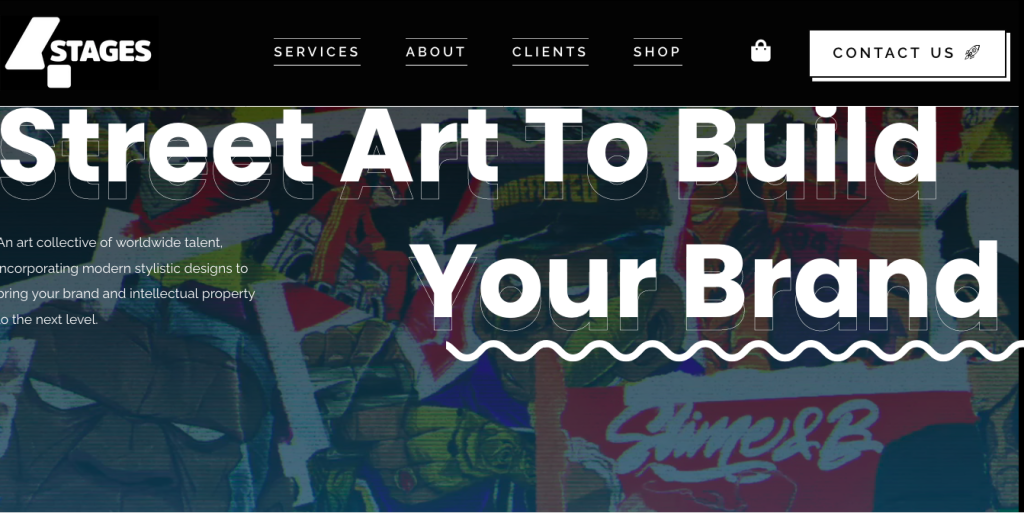
This website is a vibrant online portfolio for a street art crew called 4-Stages Collective.
Bam! You’re greeted by a huge piece of their art, right off the bat. It’s like a virtual high five, welcoming you to their world of colorful creations. The navigation bar is up top, like a friendly map. It shows you where to find their story (“About Us”), meet the artists, see who they’ve worked with (“Our Clients”).
Each section of the website feels like a different corner of their art studio. It keeps things fresh and makes it easy to find what you’re looking for, whether it’s info about the crew or killer examples of their work. There are buttons here and there, like friendly reminders to “Drop Us a Line” to connect with the crew or explore the world of street art.
In short, it’s a website that’s as cool and creative as the art they make. It’s easy to navigate, visually stunning, and full of personality – just like 4-Stages Collective themselves!
This website is a total art gallery for AI-generated art!
Whoa, cool visuals! The website starts with a big, attention-grabbing image (like a fancy museum entrance) that sets the tone for the whole experience. It’s got the website’s title in bold letters: “When art meets artificial intelligence,” which is pretty self-explanatory.
Dive deeper into the arty stuff: The website is split up into different sections, each with its own focus. Think of them as different rooms in a museum. You can check out all the cool AI-generated artwork, like a digital art show!
Basically, this website is:

The first thing you see is her big, well-placed image, kind of like a virtual welcome mat. It grabs your attention and gives you a taste of what Léni’s all about. There are buttons here and there inviting you to “connect with Léni.” They’re like friendly little nudges to explore more and get involved in her social media. Overall, the website is easy to navigate, visually stunning, and full of personality, just like Léni’s art!
Big, beautiful picture: The website starts with a big, beautiful image, kind of like the cover of a magazine. This grabs your attention and gives you a sense of the website’s style – which fits perfectly with the website’s focus on contemporary interiors.
Grid layout keeps things tidy: The website uses a grid layout to organize all the content, like articles and products. This makes it easy for you to find what you’re looking for, just like skimming the articles in a magazine.
Lots of white space makes it breathe: The website uses a lot of white space, which means there’s not a lot of clutter. This makes the website feel clean and modern, and it makes it easier to read the text.
Easy-to-read fonts: The website uses fonts that are easy to read on screens, kind of like how magazines use fonts that are easy to read on paper.

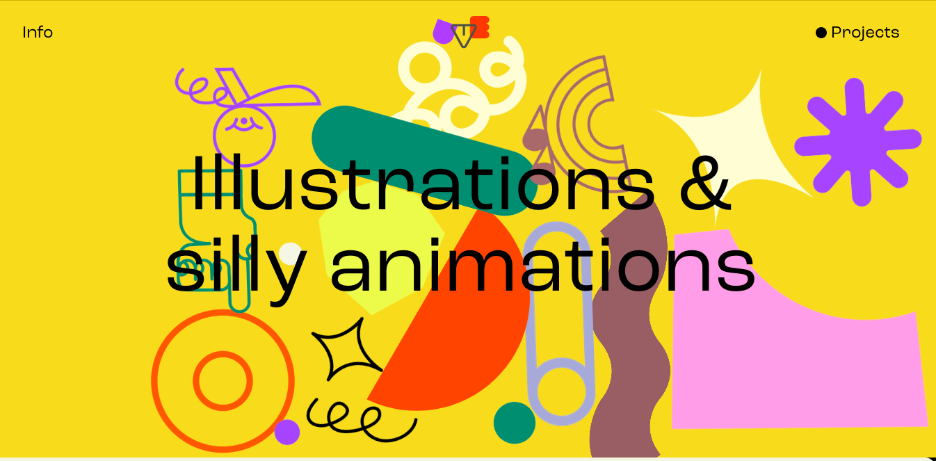
Big intro image: The website starts with a big, colorful picture that stretches across the whole screen. This is a popular web design trick to grab your attention and make a good first impression. The picture on this website is super eye-catching, with bright colors and a fun style.
Content in neat sections: The information on the website is organized into clear and easy-to-follow sections, with lots of space in between to break things up. The sections also look different from each other, thanks to different colors and fonts.
Space between things: The website uses space well, which makes it look clean and organized. This space can also be used to draw your attention to important things on the page.
Looks cool: The website is visually appealing, with its colorful pictures and fun style.
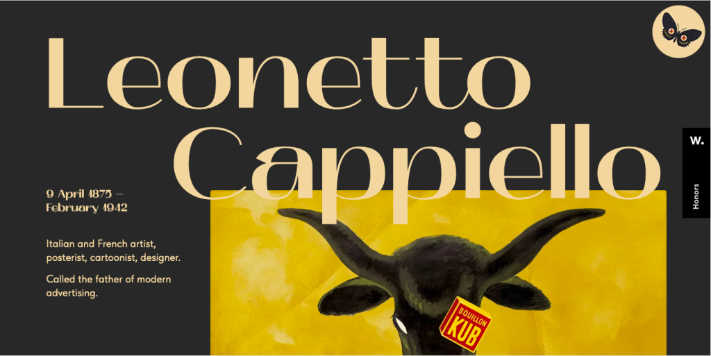
Beautiful image of butterflies that’s pretty eye-catching and sets the mood for the whole site.
Navigation made easy: Up top, there’s a navigation bar that shows you where to go on the site, whether you want to check out the home page, learn more about something, or get in touch.
Clean and tidy: The website keeps things pretty simple, which is cool. The layout is nice and clean, making the website easy to read and understand.
Overall, the website in the image looks good and does a good job of using design tricks that web pros like. It’s got a cool look, it’s easy to navigate, and it gets its message across clearly.
Here are some of the cool features this website’s got:
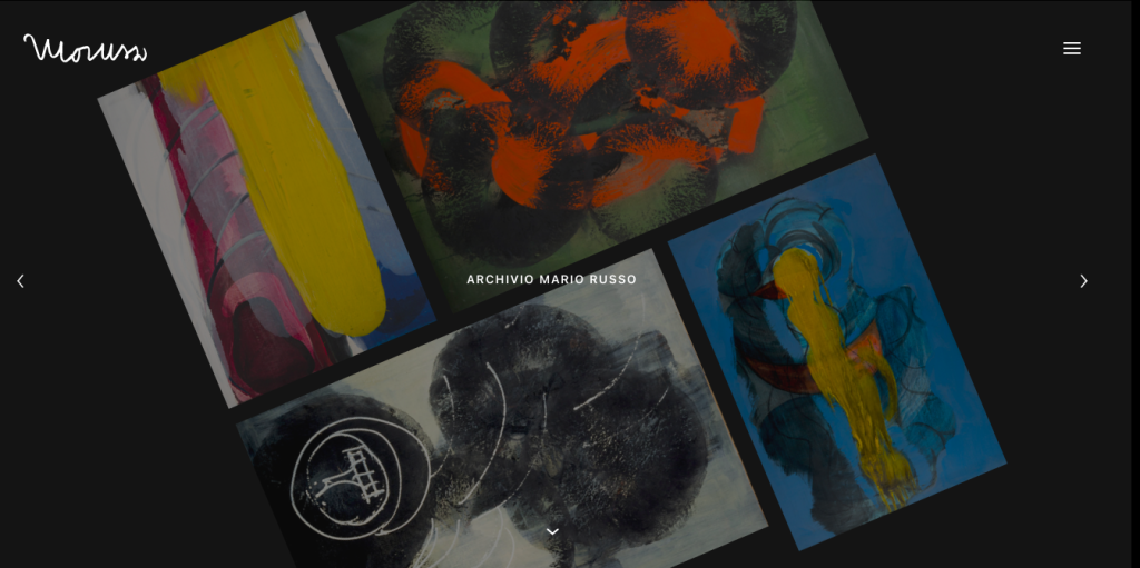
Black background: The website uses a black background, which can be a bold and modern design choice. However, it is important to use black backgrounds carefully, as they can make text and other content difficult to read. In this image, the white text and images contrast well with the black background, making them easy to see.
Large images: The website uses large images of the paintings, which can be a great way to showcase artwork. However, it is important to make sure that the images are optimized for the web, so that they load quickly and do not slow down the page.
Minimalist design: The website has a minimalist design, which means that it uses only a few elements and avoids clutter. This can make the website look clean and sophisticated. However, it is important to make sure that a minimalist design does not sacrifice functionality.
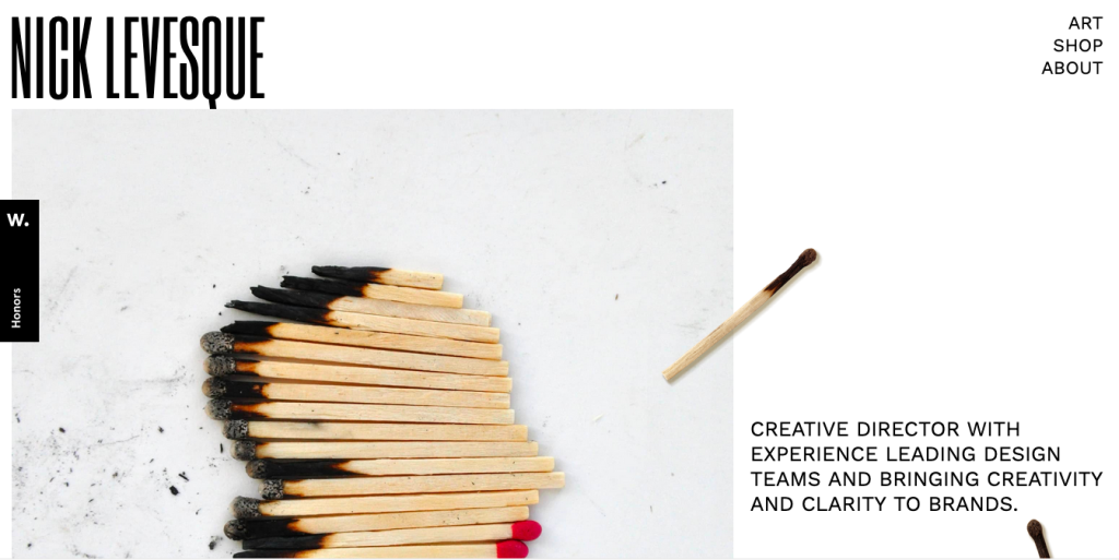
What’s cool?
Straightforward: No muss, no fuss, this site gets right to the point. You know exactly who Nick is and what he does within seconds of landing on the page.
Eye-catching: The dark and white contrast is sharp and stylish, and Nick’s pic adds a personal touch. It’s not flashy, but it definitely holds your attention.
Unique: Not many websites out there rock a single-page layout like this one. It’s different and memorable.
As we navigate the intricacies of web design for arts websites, it’s equally crucial to be mindful of potential pitfalls. In this segment, we’ll dissect common mistakes that can hinder the effectiveness of your digital showcase. By steering clear of these pitfalls, artists and web designers can ensure a seamless and engaging online experience for visitors. Let’s explore the flip side of design and unveil the mistakes that should be avoided at all costs in the pursuit of a captivating and user-friendly art website.
As our exploration of web design inspiration for arts websites comes to a close, let’s reflect on the key insights gained throughout our journey. From understanding the pivotal role of design in creating a captivating digital art space to dissecting the essential elements and avoiding common pitfalls, each step contributes to the holistic approach required for an impactful online presence.
In the ever-evolving landscape of digital art, web design emerges as a dynamic force that goes beyond aesthetics. It becomes the bridge between artists and their audience, a canvas where innovation and creativity intersect. Armed with the knowledge of essential design elements and pitfalls to avoid, artists and web designers can embark on a journey to create immersive and visually stunning art websites. As the digital canvas continues to evolve, let these insights be your guide in crafting a virtual space that not only showcases your art but elevates the entire online art experience. Watch out for our next web design inspiration just for you!
Where Creativity Meets Simplicity - Customize with Ease! Forget about Coding and Enjoy Designing Your Website.