
These days, it seems like everyone is glued to their smartphones. I don’t know about you, but I can’t remember the last time I left my house without my phone in hand. And with mobile internet usage surpassing desktop usage in recent years, it’s clear that mobile is the way of the future when it comes to visiting your landing page.
However, many businesses have yet to optimize their websites and landing pages for these mobile visitors. And that’s a major missed opportunity – especially when you consider that having a fast, seamless, user-friendly mobile experience can directly impact your conversions and bottom line.
I probably don’t have to tell you that trying to navigate a desktop-sized website on a tiny phone screen isn’t exactly fun. Pages take forever to load, links and buttons are hard to click, and good luck trying to read any of that extra small text. Makes you want to give up pretty quickly, right?
Well, that’s why building a dedicated mobile landing page experience is so important if you really want to connect with customers and make sure your message gets through. In this article, we’ll break down what exactly makes an effective mobile landing page and how you can go about creating one that helps you start converting more of those mobile visitors into leads and customers. Sounds good? Then let’s get to optimizing!
In short, a mobile landing page is a version of a webpage that’s been specifically designed to provide an optimal viewing and interaction experience on mobile devices like smartphones and tablets.
While a desktop landing page focuses mainly on converting people on laptops and desktop computers, a mobile landing page is all about making sure visitors coming from mobile devices have the best possible experience.
This means the page layout, design, content, and calls-to-action are tailored to fit compact screens and touch interfaces. The goal is to remove any friction in the browsing and conversion process that might come from trying to view a desktop page on a tiny phone screen.
Things like easy-to-tap buttons, uncluttered page layouts, brief scannable content, minimized scrolling, and simplified navigation allow visitors to quickly grasp your key messaging, interact with key page elements, and complete desired actions without friction.
At the end of the day, an effective mobile landing page should capture attention quickly, clearly communicate the intended message, and drive conversions – whether that’s a signup, download, purchase or another desired action. It’s all about removing obstacles and making it extremely easy for mobile visitors to engage.
And given that over *60% of web traffic now originates from mobile devices, having a dedicated mobile landing page to complement your desktop-based pages is pretty much a necessity these days. You’ll miss out on a huge number of potential conversions without one!
So now that you know the purpose of a dedicated mobile landing page, let’s talk about some of the key ways they differ from traditional desktop landing pages.
While desktop sites focus mainly on targeting users on full-sized devices with large screens, mobile sites are all about catering to small handheld screens and compact interfaces. And this influences just about every aspect of page design.
For example, mobile sites tend to rely on a single-column vertically scrolled layout to minimize horizontal scrolling and avoid forcing too much navigation on a small screen. Desktop sites have more flexibility to incorporate multi-column layouts.
Similarly, the amount of content and copy used needs to be abbreviated and concise on mobile to prevent excess scrolling. Attention spans are shorter on mobile, so you have just seconds to capture interest before they disengage.
Mobile sites also use larger buttons/taps that are easy to interact with using fingers over a mouse or trackpad cursor. This means simplifying and resizing navigation menus and calls-to-action appropriately.
Technically speaking, mobile sites must rely fully on responsive design and faster-loading elements to adapt across varying mobile browsers and connection speeds. Mobile users expect near instant loading times.
And when it comes to visual design, color schemes and images may be adapted to better fit small high-resolution phone displays versus using the same assets across devices.
Finally, the user goal and intended conversion outcome can also guide the focus of mobile vs desktop pages. For example, a desktop site might prioritize multiple options, while a mobile site focuses on driving a single clear action.
Does this help summarize some of the key differences in strategy and design considerations between optimizing landing pages for mobile vs desktop users? Let me know if you need any clarification or have additional questions!

I’ve hinted a few times now about why going mobile-friendly with your landing pages is so critical – but let’s talk specifics. There are a few key reasons why mobile optimization should be a priority:
As I mentioned earlier, global internet usage patterns show that more than 60% of web traffic now originates from smartphones. Some projections put this as high as 80% in certain markets. So if the majority of your visitors are on mobile, not catering to them directly is leaving tons of potential on the table.
Study after study has shown that providing a seamless mobile experience leads to big boosts in conversions relative to desktop sites. Simplified navigation, faster speeds, finger-friendly taps, and targeted messaging can dramatically increase signup, download and purchase rates from mobile visitors. If your site is still desktop-only, you could be missing 50% or more of possible conversions.
Here’s the reality – if a mobile visitor lands on your site and encounters friction like slow load speeds, awkward navigation, or buttons that are hard to tap…they will likely abandon your site entirely within just seconds. You only have a tiny window to connect on mobile before they jump ship. Optimizing for these micro-moments is key.
While mobile optimization should now be standard, many businesses still fail to adapt fully. By building a tailored mobile experience, you can stand out from the crowd and meet your audience where they already are – on their phones. Setting yourself apart from experience can be a key differentiator.
When the majority of people browsing online are now doing it on mobile, making sure your landing page messaging resonates in this medium is mission critical for any business. The user experience expectations and technical considerations vary greatly from desktop. Mobile optimization must be a priority – not just an afterthought!
Now that we’ve covered why mobile optimization is so crucial, let’s talk about some of the key elements that go into an effective mobile landing page experience. What are some of those must-have features?
First and foremost, you need to simplify and streamline the entire layout and structure of content to cater to smaller screens and shorter mobile attention spans. Use a single-column vertical layout with clear visual hierarchy. Avoid clutter. Break content into short readable sections with descriptive headers and ample negative space between elements.
Menus need large, clearly labeled tap targets spaced adequately apart for fat finger taps. Keep primary navigation streamlined – complex menus get confusing on small interfaces. Use hierarchy to focus attention on 1-2 critical paths.
Every bit of text and copy on a mobile page should be short, scannable, and straight to the point. Highlight key value propositions up front. Use bullet points and break up blocks of texts to improve readability. Drive one focused goal or conversion outcome per page.
The calls-to-action to drive conversions are even more crucial on mobile. Make sure they stand out visually, communicate value clearly, and facilitate easy interaction through finger-friendly tap zones. Prioritize 1-2 CTAs in prime locations.
With slower mobile network speeds and shorter user patience, page load speed is make-or-break. Test site speed and optimization using Google PageSpeed Insights and GTmetrix. Use accelerated mobile pages (AMP) or stripped down HTML.
Ensure a cohesive experience across varying iOS and Android devices through responsive design. Test across phone screens sizes, browsers and operating systems. Account for both portrait and landscape modes.
Get these elements right as the foundation of an optimized mobile landing page, and you’ll be off to a great start! Let me know if any part of mobile page anatomy needs clarification.
Now that you understand the key ingredients of quality mobile landing pages, let’s talk specifics on how you can actually go about building and optimizing your own:
Rather than retrofitting an existing desktop site for mobile, I highly recommend starting fresh with a natively mobile-optimized template through a site builder like Instapage, Unbounce, or Convertflow. These make it easy to build fully responsive pages with best practices baked in.
Use Google Mobile-Friendly Test and Google PageSpeed Insights to validate that your site dynamically responds across varying mobile screen sizes and readjusts layout appropriately. Check under slow 3G network settings.
Menu Streamline and simplify site navigation with a minimized number of tabs for primary paths. Offer large finger-friendly tap zones spaced adequately apart. Remove any superfluous links.
Adhere to max page length guidance for mobile by limiting page scroll height. Place most critical info above the fold. Use collapsible sections, accordions and links to supplemental pages for any secondary info to avoid endless scrolling.
Use short sections, bullet points, descriptive headers and ample white space between elements to chunk info on mobile screens. Limit paragraph lengths to 1-3 sentences optimally. Use legible font sizes including for buttons/links.
Refine page copy and value propositions for mobile screens. Lead with the most critical info. Drive visitors to 1-2 clear calls-to-action – tailor offer specifics and button messaging accordingly.
Validate the end-user experience through first-hand mobile testing. Click/tap around and provide constructive feedback. Refine design, content, CTAs iteratively.
Following these best practices for streamlining content, simplifying navigation, enhancing readability, accelerating speed, and tailoring the experience across devices should help you build high-performing mobile-optimized landing pages tailored to convert mobile traffic!
Now that you have a grasp of the mobile-focused landing page building process and best practices around designing for mobile users specifically, I also wanted to mention a few great templates you can use as a jumping off point:
Instapage: Offers 100+ professionally designed, conversion-optimized templates for various niches that can be fully customized. Many options specifically designed for mobile lead gen experiences.
Unbounce: Features a library of over 100 drag-and-drop templates optimized for lead gen and other goals. Easy customization and published quickly.
LeadPages: Tons of conversion-focused page templates for calls to action like downloads, sign ups, purchases. Very mobile optimized options.
Hubspot: Free mobile-responsive landing page template builder with lead capture functionality. Lots of customization flexibility once inside the platform.
OptimizePress: For WordPress users, includes numerous responsive pre-made templates for capturing subscribers, selling products online or driving downloads.
These are just a few of the many plug-and-play responsive landing page templates out there to help simplify and accelerate your mobile optimization process. Find one in the niche and style you like, plug in some custom branding and messaging to tailor it to your audience, attach your goal conversion events and start driving more mobile conversions in no time!

Now let’s get into some tactical design and content tips for building high converting mobile pages:
Really focus on these areas of content structure, readability, clear visual hierarchy and simplified navigation and you’ll be in great shape for higher converting mobile landing pages.
Now that we’ve covered key tips and best practices for optimizing your mobile landing pages, it’s extremely helpful to dissect some live pages executing this well. Let’s check out a few stellar examples:

Neil Patel – Digital marketer Neil Patel also utilizes best practices in this high-performing template promoting his content upgrade offer in exchange for an email address. Clean one column structure, attention-grabbing headline, scannable details, and obvious subscription form drive conversions.
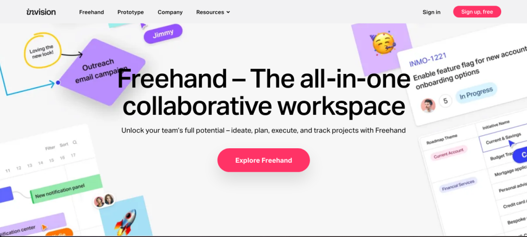
InVision – This product tour signup page uses minimal visuals in the hero banner along with a bold tagline to capture attention instantly. Very focused, scannable layout with strategic placement of concise copy blocks like partners and testimonials to guide visitors seamlessly through conversion.
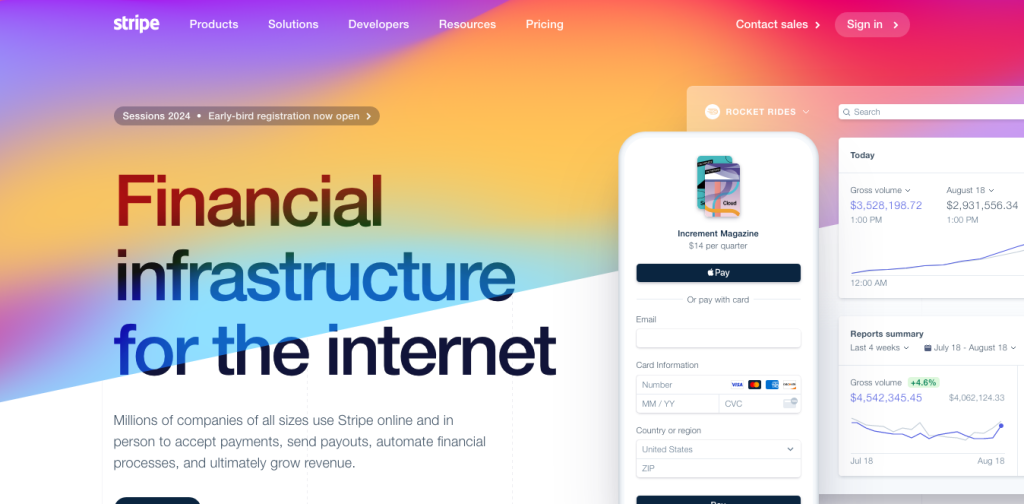
Stripe – Clean one-column mobile layout, engaging custom and animated visuals, focused copy, frictionless sign-up form, and streamlined navigation – Stripe checks all the boxes with this payments signup flow template – great for SaaS companies!
Study these and other top-notch mobile landing pages to inform your own designs. Dissect why they work and borrow ideas! Optimization is an iterative process.
Once you’ve built out your new streamlined mobile landing page experience, it’s crucial that you test it out extensively to validate functionality and find areas for refinement. Here are some key ways to test and collect feedback:
First, manually click through the entire page yourself on physical smartphones and tablets. Check speed, tap elements for responsiveness, and provide subjective feedback on design and usability. Install heatmaps to see how visitors scroll and tap.
Plug your page into Facebook and Google’s Page Insights tools to detect issues and opportunities to optimize everything from metadata to site speed and performance. Implement their enhancement recommendations.
Install click tracking software like HotJar or CrazyEgg to create heatmaps showing exactly how real visitors navigate and interact with your page. What elements draw attention? Where do visitors tap and scroll? Use the insights to refine page layout strategically.
Set up A/B testing for new page variations to see directly which versions perform best for conversions. Test different designs, copy, offers, placings of CTAs etc. and let the data guide optimization.
Collect first-hand subjective feedback through quick surveys on page load time, ease of completing desired actions, clarity of value proposition and other aspects from real users.
By combining hard metrics analysis and user feedback through a testing plan, you can continually refine the mobile experience and boost conversions over time. Testing is key!
I wanted to tackle a few frequently asked questions around optimizing landing pages for mobile:
Ideally you want to build natively mobile-friendly pages instead of just making an existing desktop site technically responsive. Catering specifically to mobile users from the start allows more customization.
You can use the same URL across devices and let the page dynamically adapt. But sometimes creating a mobile-specific URL allows more customization like docs.company.com/mobile.
Google has officially stated that mobile site speed is more important. With slower connections and shorter attention spans on mobile, fast page loads are critical to minimizing bounce rates.
Aim for 20-30% less body copy on mobile pages. Attention spans are shorter. Use lots of headers, bullet points and creative visuals to augment and enhance scannability surrounding short paragraphs.
Vertical navigation menus tend to test better on mobile as they consume less precious screen real estate. Horizontal can work with very limited top-level pages.
Google PageSpeed Insights and GTMetrix.com both offer free analysis of your mobile landing page speed performance across varying networks and devices. They provide actionable recommendations to improve speed.

Let’s recap some of the key tips to remember as you tackle optimizing your landing pages for mobile:
The companies winning at mobile UX today take the time to craft experiences specifically tailored to serve visitors on the go. They remove all friction and deliver value instantly on small screens.
By following modern best practices around mobile page layout, copy, engagement and measurement – you can connect better with audiences, guide them seamlessly to conversion and stand out from competitors still lagging with mobile.
The potential impact on your bottom line is massive if you meet visitors where they are. So what are you waiting for? Go grab one of those mobile landing page templates we covered and start optimizing for smartphone users now!
To wrap things up, I hope this gives you a comprehensive game plan for ensuring your landing pages provide an optimal experience for the modern mobile-centric world we live in.
With over 60% of traffic now originating from smartphones, catering directly to mobile users is an imperative for any business looking to drive more conversions.
We covered why you need dedicated mobile landing pages, how they differ from desktop, key design elements to include, building best practices, trends to leverage, testing strategies and more.
Remember that an effective mobile landing page should:
Keep mobile experience as a priority throughout your optimization process, continually refine based on data and user feedback, and you’ll be well positioned to connect with audiences wherever they are.
The companies truly dominating their industry verticals today have taken the time to perfect mobile user experiences across the board. Don’t leave this huge growth opportunity waiting!
So try out some of those mobile-optimized templates, start building some tailored mobile flows, and let me know if you have any other questions to come up along the journey to better engage visitors on-the-go!
Where Creativity Meets Simplicity - Customize with Ease! Forget about Coding and Enjoy Designing Your Website.