Hey there, fellow web enthusiasts! Ever wondered why some websites just seem to grab your attention from the get-go, while others leave you feeling a bit… well, meh? It’s often because of that crucial first impression made by the hero section, the star of the one webpage website’s show.
In the world of one-page websites, where every scroll counts, nailing the hero section is absolutely essential. Think of it as the front door to your digital residence—it’s the first thing your visitors see, and it sets the tone for their entire journey.
So, in this article, we’re diving deep into the art of creating an attention-grabbing hero section for your one webpage website. We’ll break down the elements that matter, share tips and examples, and leave you with the knowledge and inspiration you need to make your one webpage’s hero section shine. Ready to make a killer first impression? Let’s get started!

Now that we’ve established why the hero section is so critical, let’s take a closer look at what it’s all about.
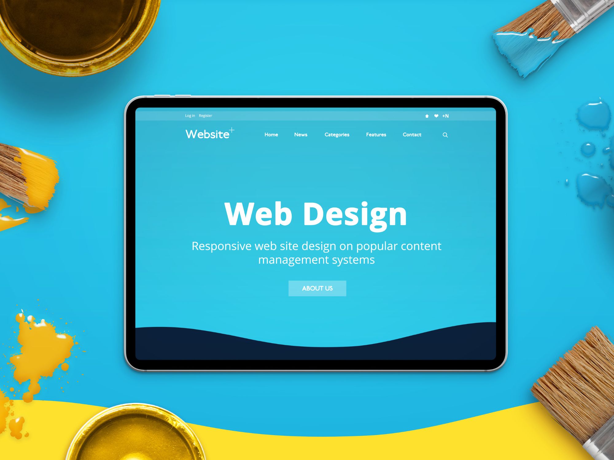
At its core, the hero section is that big, bold banner right at the top of your webpage. It’s where you can convey your website’s main message, purpose, or value proposition succinctly and attractively. In essence, it’s your website’s spotlight moment.
Think of your website as a story, and the hero section as the opening scene. It’s the first impression that can either captivate your audience or send them clicking away. A well-designed hero section not only grabs attention but also guides visitors on what to expect from your site.
To craft an effective hero section, you need to understand its fundamental elements:
The hero section is your chance to make a strong statement about your website’s purpose and value. In the following sections, we’ll delve into each of these elements, sharing tips and examples to help you create a hero section that leaves a lasting impact. Let’s dive in!
Now that we’ve explored the components of a hero section, it’s time to get clear on your single / one webpage website’s mission and purpose. After all, the hero section’s primary job is to communicate this purpose effectively.
Clarity is Key: Imagine a visitor landing on your website for the first time. They should immediately understand what your website is all about and what they can gain from it. As displayed in our website – this clarity begins with your hero section.
Identify Your Website’s Primary Goal: Before diving into design, ask yourself, “What’s the main goal of my website?” Is it to sell a product, promote a service, share information, or collect leads? Your hero section should align with and emphasize this goal.
Your hero section’s messaging should resonate with your target audience, creating an immediate connection and piquing their interest.
Remember, this section sets the stage for what’s to come on your single-page website. It’s your chance to make visitors feel like they’re in the right place and encourage them to explore further. In the upcoming sections, we’ll discuss how to craft an engaging headline and sub-headline that effectively communicate your website’s purpose. Let’s continue shaping that impressive hero section!
Now that we’ve defined your website’s purpose, it’s time to dive into one of the hero section’s most critical elements: the headline. Think of the headline as the opening line of a great book or the hook of a captivating movie—it’s what grabs your visitors’ attention and keeps them engaged.
The Significance of a Compelling Headline: Your headline should do more than just inform; it should intrigue, excite, or provoke curiosity. It’s the first impression visitors get of your website, so make it count!
In addition, remember that your headline doesn’t have to do all the heavy lifting alone. It’s often complemented by the subheadline, which we’ll explore in the next section. Together, they provide a compelling narrative that draws visitors deeper into your website. So, let’s continue crafting that irresistible hero section by working on the subheadline!
As we’ve learned, the headline is the hero section’s spotlight, but the subheadline plays a crucial supporting role. While the headline grabs attention, the subheadline provides additional context, reinforcing the main message and guiding visitors further into your website.
Understanding the Role of the Subheadline: Think of the subheadline as your chance to elaborate on the promise made by the headline. It should clarify your website’s purpose and encourage visitors to stay and explore.
The synergy between the headline and subheadline is what truly makes your hero section powerful. When visitors read these two elements together, they should have a crystal-clear understanding of what your website offers and why they should explore further. In the next section, we’ll explore the visual elements of the hero section, which can further enhance its impact. Let’s continue crafting that captivating hero section!
Beyond compelling text, the visual elements in your hero section can work wonders in captivating your audience. A well-chosen background image or video can set the mood, tell a story, and create an emotional connection with your visitors.
Visuals are a universal language. They can evoke emotions, convey messages, and leave a lasting impression. When selecting visuals for your hero section, consider the following:
1. Alignment with Your Message:
2. High Quality and Resolution:
3. Consistency with Branding:
4. Background Videos:
5. Test for Responsiveness:
Remember, visuals in your hero section should complement and amplify your message. They can engage visitors on an emotional level and make your website more memorable. In the next section, we’ll discuss the importance of a strong Call-to-Action (CTA) in guiding visitors toward their next steps. Let’s continue building that attention-grabbing hero section!
Your hero section has successfully grabbed your visitors’ attention, conveyed your website’s purpose, and set the visual tone. Now, it’s time to guide them toward the next steps with a compelling Call-to-Action (CTA).
A well-crafted CTA is like a road sign on a journey—it tells visitors where to go next. It’s the action you want them to take, whether it’s making a purchase, signing up for a newsletter, or exploring your content further.
Your CTA is the gateway to deeper engagement, conversion, and achieving your website’s objectives. Make it enticing and easy to spot. In the next section, we’ll explore the importance of ensuring your hero section is responsive and mobile-friendly to cater to a broader audience. Let’s keep enhancing that attention-grabbing hero section!
In our digital age, people access websites from a wide range of devices, including smartphones, tablets, and desktop computers. To ensure your hero section’s effectiveness, it’s crucial that it looks and functions flawlessly across all of these platforms. This is where responsiveness and mobile-friendliness come into play.
Responsive design means that your hero section adapts and scales to fit different screen sizes and resolutions. It ensures that visitors on any device have a seamless and enjoyable experience on your website.
Importance of Mobile-Friendliness Mobile-friendliness goes hand-in-hand with responsiveness but focuses specifically on ensuring your single-page website is tailored to the unique needs of mobile users. Given the increasing number of mobile internet users, this is critical.
By making your hero section responsive and mobile-friendly, you’ll create a positive user experience for all your visitors, regardless of the devices they use. This inclusivity can significantly impact the success of your one webpage website.
In the next section, we’ll explore the importance of ongoing improvement through A/B testing and iteration, helping you fine-tune your hero section for maximum impact. Let’s keep refining that attention-grabbing hero section!
Creating an attention-grabbing hero section is not a one-and-done task; it’s an ongoing process of refinement and optimization. A/B testing and iteration are powerful tools to help you fine-tune your hero section for maximum impact.
A/B testing, also known as split testing, involves creating two versions of your hero section and then measuring which one performs better. This method allows you to make data-driven decisions to improve user engagement and conversion rates.
Iterate Based on Data A/B testing isn’t a one-time endeavor. It’s an iterative process where you continually make small improvements based on the data you collect. Over time, these incremental changes can lead to significant enhancements in your hero section’s performance.
By continuously testing and iterating, you can refine your hero section to better resonate with your audience and achieve your website’s goals.
In the concluding section of this article, we’ll recap the key takeaways and emphasize the positive impact a well-designed hero section can have on user engagement and conversion rates. Let’s keep improving that attention-grabbing hero section!
Congratulations! You’ve embarked on a journey to master the art of creating an attention-grabbing hero section for your one-page website. Throughout this article, we’ve explored the essential elements and strategies to make your hero section shine. Now, let’s summarize the key takeaways and reinforce the significance of your hero section in web design.
Remember that the hero section is your website’s “front door,” and it’s crucial to make a remarkable first impression. An effective hero section can significantly impact user engagement, conversion rates, and the overall success of your one webpage website.
As you embark on implementing these insights, don’t forget that web design is a creative process. Feel free to experiment, take risks, and adapt to your audience’s preferences. Continuously monitor the performance of your hero section and be open to making adjustments based on data and feedback.
By following the principles outlined in this article, you’re well on your way to creating an attention-grabbing hero section that captivates your visitors, conveys your message effectively, and propels your one-page website to success.
Now, go ahead and apply what you’ve learned to craft a hero section that leaves a lasting impression! Happy web designing!
Where Creativity Meets Simplicity - Customize with Ease! Forget about Coding and Enjoy Designing Your Website.