Hey there, fellow web enthusiasts! Here’s another web design inspiration for you. Ever wondered about the magic behind those stunning nonprofit websites that instantly capture your attention? Well, you’re in for a treat! In this article, we’re diving into the captivating world of web design for nonprofits, exploring why it’s so crucial and, of course, showcasing some stellar examples.
Now, let’s kick things off by understanding why nonprofit websites are more than just digital billboards. They’re the virtual front doors to missions that matter. Whether it’s saving the planet, supporting communities, or championing noble causes, these websites are the heartbeat of organizations making a positive impact.
So, hang tight as we unravel the secrets behind some of the most impressive nonprofit web designs out there and discover why a killer online presence is a game-changer for these do-gooders. Ready to be inspired?

In our last inspiration article, we showcased visually-stunning educational websites for your inspiration. Today let’s discuss some nonprofit websites with good web design layout and best practices. In the digital landscape, nonprofit websites serve as the virtual headquarters for organizations committed to making a difference in the world. Unlike commercial websites, these platforms have a distinct purpose – beyond selling products or services.
Nonprofit websites are the online faces of organizations driven by a mission rather than profits. They play a crucial role in fostering connections with the community, supporters, and potential donors. These websites are information hubs, providing insights into the organization’s goals, initiatives, and impact.
One key feature that sets nonprofit websites apart is their focus on engagement rather than transactions. While a business website may aim to convert visitors into customers, a nonprofit website seeks to build relationships, inspire action, and generate support for a cause.
In essence, nonprofit websites are dynamic storytelling platforms. They use compelling narratives, images, and information to convey the organization’s mission, encouraging visitors to become part of the journey toward positive change. The effectiveness of a nonprofit website lies not only in its design but also in its ability to evoke emotion, inspire involvement, and leave a lasting impression on those who explore its virtual corridors.
Now that we’ve got a grasp on what nonprofit websites are, let’s delve into why their design is more than just aesthetics – it’s a critical component for success.
In essence, the design of a nonprofit website is a powerful tool for building connections. It goes beyond aesthetics, impacting how effectively an organization can communicate, engage, and inspire action. A positive web design experience can be the catalyst for turning a curious visitor into a committed supporter, driving the nonprofit’s mission forward.
Now that we understand why web design matters for nonprofits, let’s break down the essential elements that make for a stellar nonprofit website.
These elements collectively contribute to an effective and impactful nonprofit website. They not only enhance the user experience but also play a vital role in converting visitors into active supporters, helping your organization thrive in the digital landscape.
Now, let’s explore a curated list of 10 nonprofit websites that exemplify outstanding web design principles. These websites not only captivate visitors with their aesthetics but also effectively communicate their respective missions.

A window into a brighter future – The website opens with a hero section featuring a large, hopeful image of a diverse group of young people. This image acts as a window into the brighter future the organization is working towards, creating a sense of connection and hope. The text “Every young person should have unlimited possibilities.” lays out the website’s mission statement in a clear and concise way.

Features a modern layout with vibrant colors of yellow, black and white. Also features a big hero section with two large calls-to-action for both who needs help and who wants to help. Simple yet attractive design.

The website is fast-loading which is a big plus to web design best practices. It also features a simple yet effective section layout – similar to blogs or news/magazine-type layout. The images are in black and white which adds to the overall simplicity of the website and adds focus on the hero banner which is an update to the site’s video documentary. A very informative, and action-oriented website, encouraging users to explore the website, learn more about the contents.

A fun and colorful website – featuring high-quality images of young people which acts as a symbol of hope and unity, conveying the organization’s mission of creating a better future for all. Animated and interactive graphics are also present in the website.

Here is a clean and modern design layout for this nonprofit website for people with hearing loss. It features a simple layout combined with black and white videos and video background. Even though these videos are added, the website loads fast.

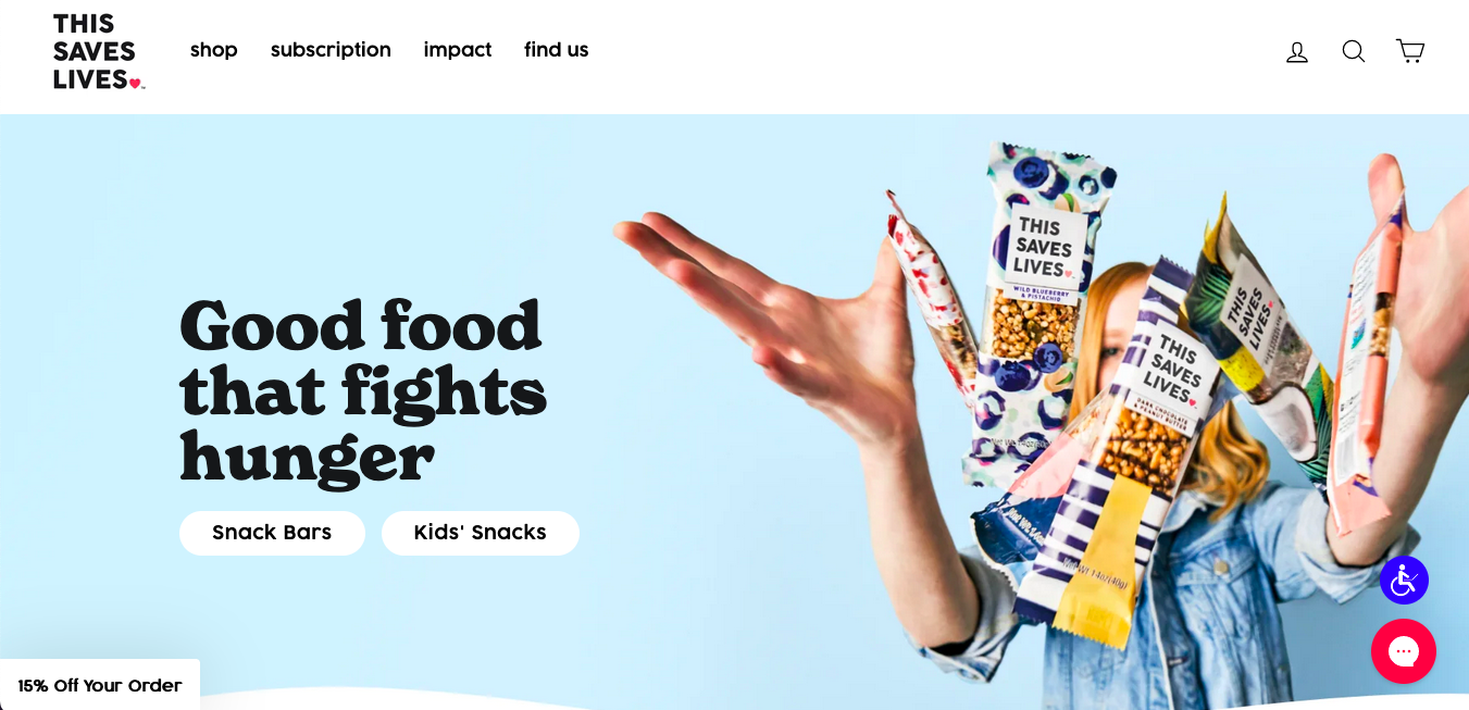
Another simple but fun website for This Saves Lives where they sell snacks and donates a portion of the proceeds to help fight child hunger. A fast-loading and colorful website with clear copy is always fun to explore.

Here is a calming and easy on the eyes website paired with images that are high-quality and attention-grabbing. The big hero banner image at the beginning that sets the scene and grabs your attention. The layout of each section is also unique but clear and easy to navigate.

This website features vibrant colors and visually-appealing graphics and artworks. The website’s typography is easy to read, and there is enough contrast between the text and background color to ensure readability.

This onepage website has a lot of things going on with texts, high-quality imagery and graphics yet it still gives a pleasing user experience. It also features modern street style design which is cool – paired with animated texts and graphics.

This nonprofit website features graphics plus text combo. A very minimal layout with no images in the homepage yet it doesn’t bore the visitors since the text and colors are creatively placed very well. You can also see a fixed navigation plus interactive graphics in each section of the page.
While it’s crucial to highlight what makes a nonprofit website shine, it’s equally important to steer clear of common pitfalls that can hinder its effectiveness. Let’s explore some web design mistakes that nonprofits should be mindful of:
By being aware of these common web design mistakes, nonprofits can proactively enhance their websites and create a more positive and effective online experience for visitors. Remember, a user-friendly and well-designed website is a powerful tool for achieving your organization’s goals.
As we wrap up our exploration of nonprofit web design, let’s distill some key takeaways that can guide organizations toward creating impactful online experiences:
By incorporating these takeaways into your nonprofit web design strategy, you can create a digital presence that not only showcases your mission but also effectively engages and mobilizes supporters towards meaningful action. Remember, your website is a powerful tool for driving positive change in the world.
Where Creativity Meets Simplicity - Customize with Ease! Forget about Coding and Enjoy Designing Your Website.