We’ve all been there before – you’re browsing a website looking for some information, click a link and…uh oh, 404 error page pops up on your screen. Annoying, right? But don’t click away just yet! 404 error pages aren’t just confusing dead ends – they actually play an important role in guiding users and enhancing their experience on a website.
In this article, we’ll dive into the purpose of 404 pages and why they aren’t just meaningless errors. You’ll learn what makes a good 404 page and how they can actually be opportunities to inject creativity and brand personality. We’ll also cover best practices for fixing and monitoring 404s as well as creating 404 pages that delight rather than frustrate users.
So don’t think of the humble 404 as a nuisance – just like thank you pages, it can actually be leveraged to provide helpful way finding as well as moments of levity and fun. Whether you’re a developer looking to improve your site’s architecture or a marketer wanting to optimize error pages, this guide will give you ideas and strategies for effective 404 page design. By the end, you’ll see these “errors” in a whole new light!
What is a 404 Error Page?
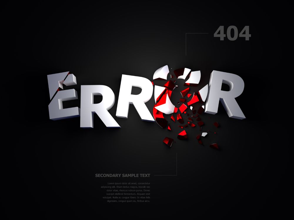
We all know the feeling – you click on a link or enter a URL and instead of the page you were expecting, a dreaded “404 Error” page. If you’re seeing a 404, it means the server was unable to find the page or resource you requested.
The name comes from the HTTP response status code 404, which means “Not Found”. Whenever the server can’t locate the page, it will return this 404 status code along with an error page explaining that the page is unavailable.
Some common reasons you might encounter a 404 error include:
The page you were looking for has been moved or deleted
There is a broken link or typo in the URL
The website’s architecture has changed
You clicked on an outdated bookmark
A well-designed 404 page will communicate clearly that the page can’t be found while also providing helpful options to get the user back on track, like site navigation links or a search bar. It maintains a consistent brand experience and avoids overly-technical jargon.
So while 404s indicate something is amiss behind the scenes, users really just need a simple, straightforward note explaining the page can’t be found and what they can do next. A 404 shouldn’t be a dead end!
Are 404 Error Pages Important?
You may think 404 pages are just harmless error messages that can be ignored. But these unsung heroes actually play an important role in the user experience and site architecture! Here’s why 404s matter:
They prevent user frustration when a page can’t be found. A customized 404 page is much more friendly and helpful than a default “Page Not Found” browser error.
They guide users and provide helpful next steps. An effective 404 page gives users options to find what they need, like site navigation links and search bars.
They maintain brand consistency. A 404 page designed with your brand style, tone, and messaging keeps users within your site’s visual experience.
They can enhance SEO rankings. Unique, high-quality 404 pages tell search engines your site is well-organized and maintained.
They help identify technical issues. Monitoring 404 errors can reveal broken links and other problems to address.
They allow for creativity and fun! 404 pages present opportunities to inject humor and personality.
So the lowly 404 is not just a random error, but an important UX touchpoint. Crafting user-friendly 404 pages improves site navigation and brand experience. Next time you encounter a “File Not Found”, remember the humble 404 is doing its job!
The Purpose of 404 Error Page
We know 404 pages indicate a missing page, but what is their broader purpose? Here are the core goals and objectives of 404 error pages:
Notify the user the page they requested couldn’t be found. The 404 status code and messaging makes this clear upfront.
Provide navigation options to help the user. This includes site menus, search bars, and calls-to-action to link to relevant content.
Maintain brand consistency. Aligning with brand style creates a seamless user experience.
Set a friendly, helpful tone. Clear language avoids frustration and guides users.
Explain the error concisely. Technical jargon is minimized to focus on next steps.
Inject creativity and fun! 404s are opportunities to showcase brand personality.
Promote other site content. Recommendations and links to related content boost engagement.
So in summary, the main goals are to: notify the user of the missing page, provide helpful navigation, maintain branding, set an appropriate tone, explain the error clearly, enable monitoring, get creative, and promote other content! When designed well, 404s turn a dead end into a delightful detour.
What is a Good 404 Error Page?
When designing and optimizing 404 pages, what are the hallmarks of an effective user experience? Here are key ingredients for a good 404 page:
Simple and scannable layout. Avoid clutter and lengthy paragraphs. Use clean design, plenty of whitespace, clear headlines and bullets.
Clear explanatory messaging. Open with a simple headline like “Page not found” and a brief line explaining the error.
Helpful navigation options. Provide site menus, search bars, and suggested content links.
Friendly, solution-oriented tone. Avoid overly formal language and emphasize how the user can get back on track.
No heavy technical jargon. Keep terminology simple and focus on next steps.
Humor…if appropriate. Funny illustrations or copy can boost engagement, but know your audience.
Effective call-to-action. Give the user a distinct next step, like searching or clicking home.
Consistent across site. Align the 404 page with other core site templates and pages.
Get these elements right, and your 404 error pages will provide a seamless, on-brand experience! Users will feel guided, not frustrated.
Do’s and Don’ts of a 404 Error Page
Want to create user-friendly 404 pages that delight visitors? Here are some top do’s and don’ts:
Do:
Keep the page simple and scannable. Avoid clutter.
Use clear, concise explanatory text.
Maintain branding like colors, logos and imagery.
Provide helpful navigation options.
Set a friendly, reassuring tone.
Include an effective call-to-action.
Align with the style of core site pages.
Consider adding tasteful humor if appropriate.
Monitor your 404 errors to identify fixes.
Don’t:
Use complex technical jargon and terminology.
Leave the user feeling frustrated or abandoned.
Make the page overly cluttered or difficult to parse.
Break from the established visual brand.
Lose your brand’s tone and messaging.
Leave the user with no guidance on where to go.
Allow inappropriate humor or risky content.
Let 404s pile up without addressing underlying issues.
Follow these tips, and you can craft 404 error pages that keep users on-site and turn headaches into delights!
How to Fix 404 Error Page?
Encountering too many 404 errors? Here are some tips for troubleshooting and fixing those pesky “Page Not Found” gremlins:
Review site architecture – If content has been relocated, update site navigation and menus. Create redirects to new URLs.
Fix broken links – Crawl your site to identify broken links causing 404s. Replace with working URLs.
Update old content – Delete or refresh outdated, obsolete pages that attract 404s.
Implement 301 redirects – For changed URLs, set up 301 redirects to route traffic to the correct page.
Use 404 monitoring – Services like Google Analytics track 404 errors to surface issues.
Customize the 404 page – Create a branded, user-friendly 404 page to improve the experience.
Inform site editors – Educate content creators to avoid introducing broken links.
Remove bad links – Disavow irrelevant external links attempting to point to your site.
Add more site search – Make site search prominent to help users easily find relocated content.
Create content sitemaps – Structured sitemaps help crawlers discover new content.
Take these steps to keep your site’s architecture tidy and address the underlying issues generating 404s. With some strategic fixes, you can significantly reduce headaches both for users and site admins!
How to Make Your 404 Error Pages Into a Fun and Delightful Moment?
404 errors don’t have to be boring or frustrating. With a bit of creativity, you can turn your error pages into fun, engaging experiences that delight users!
Add humor – Include funny illustrations, GIFs, or witty messages to bring a smile. But know your brand voice.
Get clever with copy – Use humorous headings and clever captions to add personality. Puns, rhymes or alliteration work.
Make pop culture references – Does your brand allow wink-wink references to viral memes or trends? A well-placed reference can connect with audiences.
Surprise with randomness – Weird redirects to silly places or absurd images can make users laugh in surprise.
Promote other content – Suggest related articles, products, or deals to turn mistakes into marketing moments.
Add an easter egg hunt – Hide fun little secret interactions on the page for those who click around. Build exploration.
Spotlight your brand mascot – Insert your branded character into the page with some silly pose or reaction.
Go retro – Give a nod to early internet pages with some throwback web design and cheesy GIFs.
With the right blend of lighthearted copy, entertaining visuals and unexpected moments of fun, you can turn the annoyance of 404 errors into delightful detours keep visitors engaged!
Inspiration: 404 Error Page Examples
Need some inspiration for crafting clever and effective 404 error pages? Here are a few great examples from major brands:
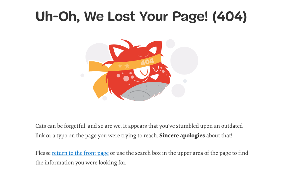
Smashing Magazine’s funny 404 cat mascot combined with internal links of the site for visitors to click.
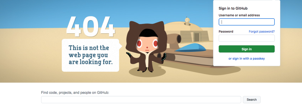
Github‘s playful Octocat mascot against a fun background with a search bar.
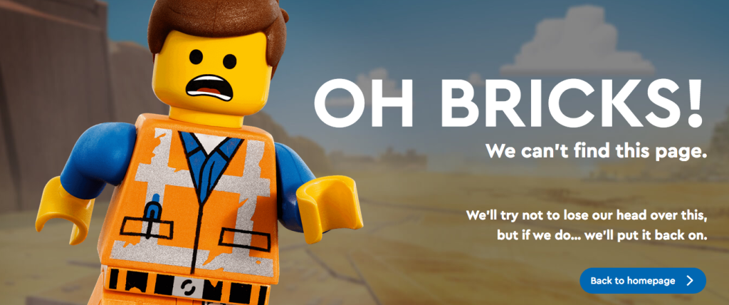
LEGO‘s brick-style illustrations and colors that align with their branding.
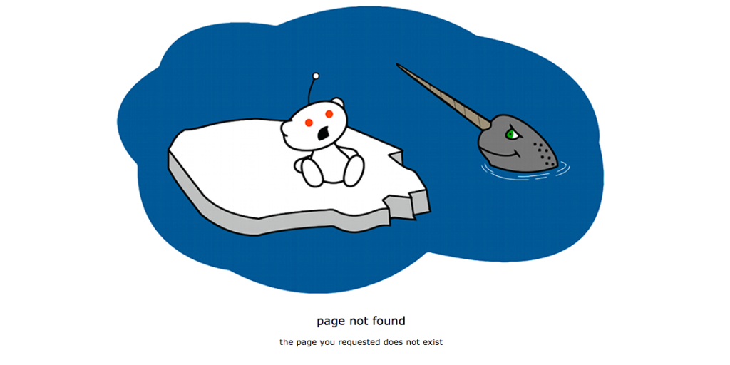
Reddit‘s simple yet funny messaging and throwback 90s web aesthetics.
The best 404s combine brand consistency, helpful navigation, a bit of levity, and creative visuals to delight visitors. Studying examples from leading companies can spark ideas for your own improved error pages.
Frequently Asked Questions About 404 Error Pages
Still have some questions around 404 pages best practices? Here are answers to some common FAQs:
What are the most common 404 error causes?
Broken links from reorganized content or typos.
Outdated, deleted pages that still get requested.
External links pointing at wrong URLs.
Bots/crawlers trying to scan invalid pages.
Should I customize my 404 page?
Absolutely! A branded 404 aligns with your site design, helps guide users, and improves the experience.
How can I track and monitor 404 errors?
Use site analytics tools and 404 error monitoring platforms to identify problem pages and links causing frequent 404s.
What’s a good response time for a 404 page?
Aim for <200ms response time. A speedy 404 looks more professional and prevents compounding user frustration.
Should I include links on my 404 page?
Yes, provide helpful navigation links, site search, and suggested content to help users find what they need.
A properly optimized 404 page is an important part of overall site health and UX. Addressing common questions around 404 best practices ensures your error pages are helpful rather than frustrating!
Key Takeaways and Conclusion
To wrap up, here are some key points to remember:
404 error pages serve an important purpose – they notify users when a page can’t be found and provide helpful guidance.
Well-designed 404 pages follow best practices like simple layouts, clear messaging, strong branding, useful navigation links, and a friendly tone.
Fix common 404 errors by addressing broken links, honing site architecture, creating redirects, and monitoring error data.
Get creative and inject humor, surprises, or brand mascot cameos to delight visitors.
Study examples from major brands to spark ideas for your own improved 404 page.
Follow FAQ tips on common 404 causes, customization, speed, and more.
While 404s indicate something went wrong, they present opportunities to guide users, maintain brand consistency, and even add moments of levity. By taking the time to optimize these oft-overlooked pages, you can turn frustration into fun and improve the overall user experience.
So don’t dread the 404! A well-crafted error page is a worthy investment for any brand seeking to polish its online presence. Just remember – a friendly 404 creates smoother site navigation and happier visitors.